
dragonfly
Combatting social media addiction and promoting mental well-being empowerment.
.webp)
Time
+6 weeks
Project Type
student project
scope
responsive website
My role
Ux/Ui Designer
Overview
I've always had an interest in mental health, specifically self-esteem, as I believe it's a critical factor in many mental health issues. Some years ago, I partnered with a psychologist to develop a product targeting teenage girls. We curated a monthly package featuring exercises to address perfectionism, comparison, boundaries, and meditation, along with a diary and planner. Unfortunately, when we presented our prototypes, the feedback was underwhelming, and the girls had difficulty maintaining consistency with the activities. They expressed a preference for engaging with the planner that focused on social media and self-esteem issues.


Image of my first product aimed at boosting self-esteem in teenage girls
A few years later, during my first UX/UI project, I confirmed that excessive social media scrolling was at the heart of self-esteem problems. Both men and women, not just teenage girls, struggled with feelings of inadequacy, constant lack, and heightened anxiety, especially while on platforms like Instagram. The biggest challenge was the addictive nature of social media. Overcoming the scrolling habit was tough because the urge to continue scrolling only got stronger when they tried to stop. So, my main goal was still finding creative solutions for this core issue.
This is how Dragonfly was born, with the mission to combat social media addiction and enhance users' self-esteem and mental well-being through personalized guidance and incentives, catering to individuals of all genders and ages. The platform partners with mental health-aligned brands to reward users for taking breaks from prolonged screen time and embracing offline activities.
1research
Research goal
What is causing people to feel more depressed and anxious after using social media?
Research objectives
- Learn which social media platforms do people use the most?
- Determine at what age do people use most social media
- Understand how people feel after using social media
- Determine if people are using any tools to feel better after using social media
Methods
- Surveys to quantify self-esteem issues, identify the tools used, and investigate feelings following social media engagement.
- Conduct interviews to explore participants habits, responses, and any enhancing strategies.
- Competitive analysis to review how other platforms handle these issues.
- Create personas from research to grasp diverse user needs and expectations.
.webp)

Research goal
What is causing people to feel more depressed and anxious after using social media?
competitive analysis
Competitors


In summary, these mobile apps are tailored to address specific facets of well-being, each with its unique focus, encompassing aspects ranging from productivity to mental health and self-care. While each app serves a distinct purpose, finding one that effectively addresses the specific concern of social media's impact on self-esteem was challenging.
surveys & interviews
The research process was initiated by creating a survey to gather quantitative data regarding the demographics of individuals affected by social media's impact on self-esteem. The survey also inquired about the tools or strategies employed to address these concerns and usage patterns on these platforms.
After the survey, interviews were conducted to gain deeper insights into the experiences of some of these individuals regarding the impact of social media on their self-esteem. These interviews revealed many intriguing findings, and to organize the ideas, an affinity map was found to be the most helpful.
survey insights
participants
33
gender
Men & women
Age range
15-65
Reside
world wide
93%
84%
70%
90%
100%
80%

Interview insights
Research Results
Throughout the seven interviews, a consistent theme surfaced: the influence of social media on self-esteem attributed to ongoing comparisons particularly Instagram. Intriguingly, stepping away from this platform, often triggered a 'fear of missing out' (FOMO), reigniting their addiction and prolonging screen time.
Unanimously, the participants emphasized for resources and support to combat addiction and foster a healthier relationship with technology. They underscored the necessity of practical tools and strategies for managing social media use, like unfollowing specific accounts or taking periodic breaks from the platform.
Target Audience
Instagram users that share a desire for connection and use social media to stay connected with others. They engage in personal development practices, but also face challenges related to their social media use. Some experience anxiety due to a constant feeling of lack, while others find themselves scrolling excessively and experiences FOMO when disconnecting from Instagram. Both recognize the importance of using social media in a healthy and productive way.

2Defining
Defining the problem stemmed from identifying the most significant pain points:
Experiencing anxiety, particularly from scrolling through Instagram.
Using timers to limit social media, but feeling
anxiety and FOMO
Trying to quit but relapsing
into extended use
How might we help users feel better about themselves, manage Instagram addiction and take a break from the app without experiencing FOMO and anxiety?

.webp)
The proposed solution involves the development of a platform that utilizes positive reinforcement, enabling users to earn points based on the time they spend away from the Instagram platform, since its the one that has the most negative effect.
These accumulated points can then be exchanged for rewards that focus on wellness and mental health, offering a tangible incentive for individuals to take regular breaks from the app and experience a refreshed state.
prioritization
Account creation
Tracker
Rewards
Redemption prices
Site Map
After choosing the features, the platform was structured to visualize content and assess its hierarchy. 'Deals and discounts' were placed under categories, as it's essential for parents, even though the platform can function without it initially. This provides an overview of the platform's organization before the card sorting exercise.

User & task flows
User experience was improved by crafting task flows and user flows for two personas: new users aiming to earn points and set time limits, and users ready to redeem rewards. Taking user feedback into account, the website's information architecture was optimized, prioritizing a seamless and intuitive flow.
Flows created
- Tracker/timer
- Rewards
- Profile
3Design
identity
When creating the brand, the process began by identifying the core values that best represented...
The values were sorted and prioritized to create a brand name that represented the identity and value of the brand:
Dragonflies connect us with nature and inspire us to explore new activities that promote our well-being and they also:
“Balance, exploration,support, connection, self-realization,guidance”
“Dragonfly”
“Symbolize guidance, support & friendship in addiction recovery”
After deciding the name, the process of sketching some logos began:
Which led to three design proposals:
After multiple iterations, a modern approach was chosen, emphasizing simplicity and freshness.


Design System
The brand's core values were thoughtfully embodied in the color palette. By applying color psychology principles, the chosen hues were selected to effectively convey these values while ensuring accessibility. Likewise, the typography was carefully chosen to align with the brand's tone of voice and readability. It strikes a balance between playfulness and reassurance, relaxation and support, as well as casualness and confidence


Low fidelity wireframes
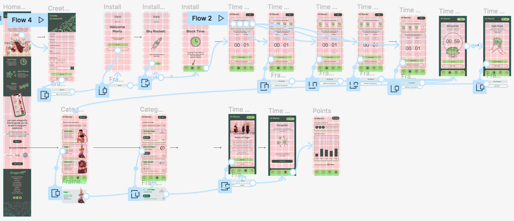
Using the Site Map, the user flow, and the task flow, mobile wireframes were developed for the dominant tasks of the site: timer and rewards. Designing low and mid-fidelity wireframes was important because it allowed conceptualization, iteration, and led to a more user-centered and intuitive design.
Timer

Timer

High fidelity wireframes
After establishing the brand and identity, the design phase advanced to creating high-fidelity screens for crucial sections of the platform, including the Sign-Up process, onboarding, timer, and rewards.
High fidelity screens for Sign Up, Timer and rewards


.webp)
.webp)


User Testing
participants
5
gender
Men & Women
Social media stauts
active
Age range
25-48
platform
ZOOM
After finalizing the high-fidelity wireframe designs, the next step was the development of a test prototype. A script was prepared to guide participants through the tasks to be tested, which included:
task flows to test
- Navigate the homepage
- Sign up
- Block time
- Redeem reward
goal
- Evaluate if the platform is easy to use.
- Identify features or functions that can be improved.
- Identify how long it takes to complete the tasks.
- Determine whether the platform meets user needs.
test Results
The platform received a 4/5 rating, and 3 out of 5 participants recommended a vital shift in the language, highlighting addiction, companionship, and well-being. This invaluable input led to several enhancements in the prototype, elevating its overall user-friendliness and effectiveness. As a result of this valuable feedback, I not only adjusted the language but also made changes to the brand and UI design to further enhance user-friendliness.


.webp)

.webp)
.webp)


.webp)
.webp)
.webp)


.webp)


.webp)


-poster-00001.jpg)


