
ROSSI
Redesigning the company’s e-commerce experience, their imagery and ensuring its responsiveness.
.webp)
Time
+4 weeks
Project Type
Freelance Work
scope
responsive web design
My role
UX, research & Branding
Overview
Calzados Rossi is a family-owned business established in 1948 known for crafting top-quality men formal footwear in Venezuela. They reached out because they've encountered challenges with their current website and imaging as they aim to expand their online presence. They displayed their shoe collection on the website, and orders were facilitated through WhatsApp, placing them at a disadvantage in the e-commerce landscape.
During the research process, more challenges surfaced, such as the introduction of a women's section, reaching out to a younger audience, and bridging the gap between online and offline shopping. All the while, they aimed to revamp their brand identity.
1research
Research goal
Discover new ideas to improve the brand's online navigation and branding, while uncovering ways to help them achieve their business goals
Research objectives
- Identify user pain points to improve navigation.
- Understand how users currently search for and select items on the platform to enhance item search and selection.
- Identify important online shopping features.
- Gather insights from competitive analysis for a unique user experience.
Methods
- Surveys to study target audience.
- Competitive analysis to identify areas where competitors are excelling
- Interviews to gain insights from people who know and shop the brand.
- Create personas from research to grasp diverse user needs and expectations.
competitive analysis
Competitors
.webp)
.webp)
.webp)
.webp)
Each brand has its unique strengths. Cole Haan stands out with a comprehensive set of features, offering customization, chat support, and user reviews. Hush Puppies, while providing a decent user experience, lags slightly in these areas. By analyzing the competition, Calzado's Rossi could identify areas for improvement. Design-wise, updating the brand logo from its outdated red to black and white could be beneficial.
Enhancing brand imagery would help it stay competitive. Furthermore, improving the user interface and experience, along with offering more information and streamlined shopping processes, are areas where Rossi could make notable enhancements.
surveys & interviews
Despite the company's primary focus on men's shoes, they also import women's shoes, exclusively available in-store. I chose to include women in the survey to gain insights into their online shopping habits and their occasional purchases for their partners.
The interviews were tailored for men, in accordance with the website's primary focus, as the client had no plans to include a women's section. It's worth mentioning that all interviewees were familiar with the brand.
survey insights
participants
14
gender
20% women 80% men
nationality
venezuelan
Age range
25-65
Annual Shoe Buys
websites
experience rating
key website
online Shoe choices
decisive factor
Interview insights
Research Results
The research found distinct shopping patterns: women bought shoes more often than men, preferred brands were noted, and in-store shopping was favored, especially for dress shoes. Online shopping was preferred for sneakers, with a focus on brand reputation, competitive prices, and website features. Calzados Rossi's brand image issues led many to choose competitors, despite similar prices.
The website itself exhibited various challenges, including low-quality images, outdated branding, limited filtering options, the absence of online purchasing, and a lack of inviting in-store experiences. The absence of a women's section and sales section on the website were also noted, along with a complex information architecture.
Target Audience
Martin
A fashion-savvy software engineer who shops favorite brands twice a year, prefers casual shoes and mobile shopping, only trusts known sports shoe brands' fit.
Favorite Shoe brands
.webp)
.webp)
.webp)
.webp)
.webp)
Goals
- •Finding affordable options
- •Discovering fashionable brands
- •Staying on trend
- •Find shoes that not only look great but also last a long time.
- •Enhancing his online shopping experience
- •Stay comfortable
.webp)
Motivation
- •Desire to express his personal style and stay current with fashion trends.
- •Finding shoes that offer both style, price and comfort for everyday wear.
- •Discovering a convenient and user-friendly online shopping experience that saves him time and effort.
Needs
- •Easy returns and exchanges
- •Reliable delivery
- •Trustworthy recommendations
- •Access to a wide selection of trusted brands that offer the styles he prefers.
Frustrations
- •Lack of sizing Information
- •Lack of sales and discounts
- •Limited availability of his preferred brands
- •Discovering that a desired shoe is out of stock
- •Lack of detailed Images
Adolfo
Values durability, price, and brands reflecting his style. He's a traditional shopper who mostly visits physical stores, occasionally shops online. Adolfo prefers timeless styles like oxfords, loafers, and dress shoes.
Favorite Shoe brands
.webp)
.webp)
.webp)
.webp)
Goals
- •Invest in footwear that offers longevity and stands up to regular wear.
- •Seek brands that resonate with his conservative and practical taste and mindset.
- •Purchase from reputable brands known for their craftsmanship and integrity.
.webp)
Motivation
- • Seeks brands that resonate with his conservative and traditional style preferences.
- • Find shoes that are comfortable
- •Align his style with that of his family, keeping up with evolving fashion trends.
Needs
- •Durable footwear with classic and timeless styles
- •Brand alignment with his preferences and values.
- •Access to more fashionable footwear to align with evolving fashion trends, possibly influenced by his daughters.
- •When shopping online he seeks user-friendly features like detailed product descriptions and a straightforward checkout process to replicate the in-store experience.
Frustrations
- •Encountering brands with a poor reputation for quality or reliability.
- •Limited Access to Physical Stores.
- •Frustrated if he cannot find suitable dress shoes or footwear for special occasions in the classic styles he prefers.


2Defining
Defining the problem stemmed from identifying the most significant pain points:
Users favored online sneaker purchases but hesitated with unfamiliar brands, particularly for dress shoes.
Complex information architecture and no online purchasing led to site abandonment
The brand’s image issues led many to choose competitors, despite similar prices.
How can we elevate the entire Calzados Rossi shopping experience, bridging the gap between online and offline channels, while also enhancing brand perception?
To address the problem, several solutions were implemented, including:
- The establishment of an online shopping option,
- The introduction of an online store locator for convenience,
- The concept of personalized appointment scheduling to create a more inviting in-store experience,
- Maintaining a customer support system through WhatsApp for assistance,
- Placing importance on sustainability and environmental responsibility.
- Ensure consistency in branding and elevate the imagery associated with Calzados Rossi.
prioritization
A prioritization exercise was conducted to determine the features that should be given higher priority. Based on this exercise, the following features were identified as priorities:
P0: Must-have
P1: Nice to have
Feature Name
description
Research supporting it
Homepage
shoes
accessories
store
guide
about
footer
Womens
sales
seasons

Information Architecture
The information architecture was organized according to the feature roadmap. Initially, the women's section was not included, but after conversations with the client it was introduced with a disclaimer that women's shoes were exclusively available online and at the main store, not at other nationwide locations. The shoes section was categorized by gender and then by types of shoes. Seasonal divisions were omitted as they depended on sales throughout the year, and a sales section was not included as wholesale buyers did not receive discounts.
In the Accessories category, there was only one item manufactured: belts.A dedicated guide section was incorporated to educate clients about shoe care, sole guides, materials used, and fitting guidance. The 'About' section was renamed 'Legacy' and included segments about the company's history, sustainability efforts, and noteworthy stories. This section covered achievements, fun facts, and famous individuals who have worn their shoes.
.webp)
3Design
Branding & ui design
When the website's redesign was initiated, addressing the outdated branding and logo was identified as a top priority. This observation was further validated through competitive analysis, surveys, and interviews. Participants underscored that the red color felt old-fashioned, the images didn't resonate with them, and the overall design and tone of voice evoked a '90s relic. In response to these insights and within the constraints of time, minor adjustments were made to the brand's images: fine-tuning the logo color, removing the drop shadow for a contemporary touch, modernizing the website's typography, and adopting a friendlier communication tone. I also integrated image references to introduce an elegant and fresh appearanceas well as engaging videos to enhance the overall user experience and convey the comfort of the shoes.
Adjustment of the logo


typography update


COMMUNICATION TONE


IMAGING & VIDEO

Adjustment of the logo
.webp)
.webp)
typography update
.webp)
.webp)
COMMUNICATION TONE


IMAGING & VIDEO
.webp)
wireframes
The initial step involved designing mobile wireframes, which were subsequently refined into high-fidelity desktop designs, all while focusing on the user journey that begins with the homepage and covers the process of searching for and purchasing a black oxford shoe. By studying the competition and other high-end shoe brands inspiration was gathered for almost every screen.
Homepage:

Menu:

Product category:

Payment:

Payment:
The user has the choice to buy the shoe using various payment methods that are compatible in Venezuela. They can also select either delivery or in-store pickup.
(Scroll vertically to view complete screens)
%201%20(2).webp)
.webp)
%201%20(6).webp)
%201%20(7).webp)
%201%20(8).webp)
(Scroll vertically to view complete screens)
.webp)
.webp)
.webp)
.webp)
.webp)
User Testing
participants
4
gender
men
nationality
venezuelan
Age range
30-45
platform
zoom
Once the high fidelity wireframes had been completed, the next step was to create a prototype for testing. To do this, a usability test plan was developed which involved several key steps. First, participants were recruited to take part in the testing process. Next, the specific flows to be tested were identified and selected.
Key areas to test
- Evaluation of Information Architecture
- Website Navigation and Purchase Simulation
- Assessment of Product Images and Branding Materials
- Review of Customer Retention Strategy
goal
- Assess the prototype's appeal, intuitiveness and ease of use.
- Identify areas where features or functions could be improved.
- Measure the time taken to complete essential tasks.
- Determine whether the website effectively addressed the needs of these users.
.webp)
test Results
Overall, participants expressed satisfaction with the website redesign, finding it easier to navigate, locate desired items, and make purchases. They showed a greater interest in browsing for shoes compared to exploring other website sections. Generally, they found the website to be highly intuitive. However, some challenges were encountered and corrected:
Before
.webp)
.webp)
- Difficulty in identifying the arrows within the carousel to switch between
cover images. - Sneakers was featured as the main image in the carousel, in line with research findings showing that many participants prefer buying sneakers online. However, some participants were surprised by this choice, as they typically associate the brand more with dress shoes.
After
.webp)
.webp)
- Arrows were located to the left side to preserve design principles.
- The carrousel primary option now showcases videos and images of classic shoes in accordance with the principles of memory and visual design.
Before
.webp)
- 3.
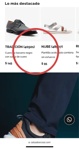
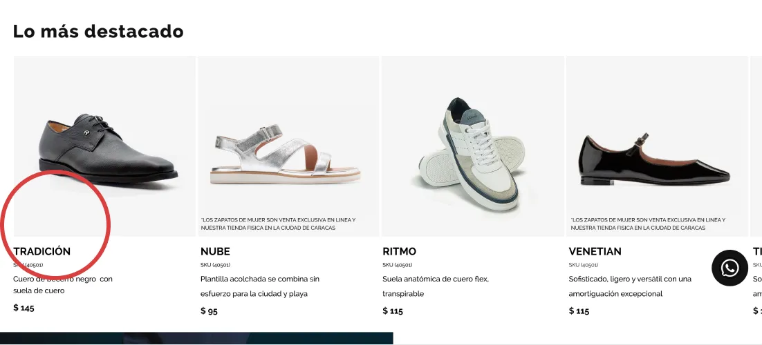
- Participants raised concerns about the SKU numbers being placed alongside the shoe names. For some, it appeared as an error, despite this being consistent with the client's naming convention. The purpose was to pair it with a new name for the shoes, aiming to enhance the communication tone.
After

- The priority of SKU was reduced but maintained its visibility based on the client's request.
Before
.webp)
After
.webp)
- 4.
- Participants found the menu arrangement confusing, as it initially displayed "by style," followed by other options, and then the available styles, causing confusion. This error was only made in the mobile version
Before
.webp)
After
.webp)
- 5.
- Participants expressed a wish to save their payment details for future purchases.It was implemented exclusively in the mobile version, as the desktop version's flow doesn't encompass the payment option.
Before
.webp)


- 6.
- The invitation to schedule an in-store shoe fitting appointment received mixed feedback. While the idea was appreciated, participants indicated they would be more inclined to use it if additional incentives were offered, such as discounts or a guarantee of their shoe size's availability in-store.
- 7.
- Participants also highlighted the importance of having the option to pick up their shoes in-store and complete the payment there to enhance user retention. Additionally, they expressed the need for easy access to the store's schedule information.
After
.webp)

- An incentive was introduced to encourage store visits and shoe purchases.
- The schedule and address of the main store was displayed
- The link to view other store locations was removed, as this incentive is exclusively applicable to the main store.
Final Outcome


Future research
While the website has received positive user feedback, its success as an e-commerce platform will be measured with conversion rates, average order value, total revenue and customer retention rate. Additionally, monitoring cart abandonment rates, mobile conversion rates and WhatsApp interactions will be crucial in determining its effectiveness. Furthermore, gathering customer feedback and enhancing their social media will further help gauge the e-commerce website's performance and potential for growth.


